Published: Jan 01, 2026 | 3 min read
PX to EM Conversion Made Simple for Responsive Design
Stop guessing font sizes - master relative units for perfect responsive layouts by using our free PX to EM converter tool.
Master relative units for perfect responsive layouts
87% of responsive design issues stem from improper unit conversion. This guide explains when and how to convert PX to EM using our free conversion tool.
The Conversion Formula
Basic Calculation
1em = parent element's font-size (usually 16px by default)
Formula:
em = desired_px / parent_font_size_pxExample: 24px ÷ 16px = 1.5em
Common Conversions
| PX | EM (16px base) | Use Case |
|---|---|---|
| 12px | 0.75em | Small text |
| 16px | 1em | Body text |
| 24px | 1.5em | Subheadings |
| 32px | 2em | Main headings |
When to Use EM vs REM
Our converter tool supports both units:
- Use EM for component-relative sizing (buttons, cards)
- Use REM for global sizing (typography, spacing)
- Pro Tip: Set base font-size to 62.5% (10px equivalent) for easier calculations
Responsive Design Techniques
Media Query Breakpoints
Use EMs for consistent breakpoints across devices:
- •
40em = 640px - •
60em = 960px - •
80em = 1280px
Component Scaling
Elements that should scale with their container:
- •
Buttons - •
Form inputs - •
Card components
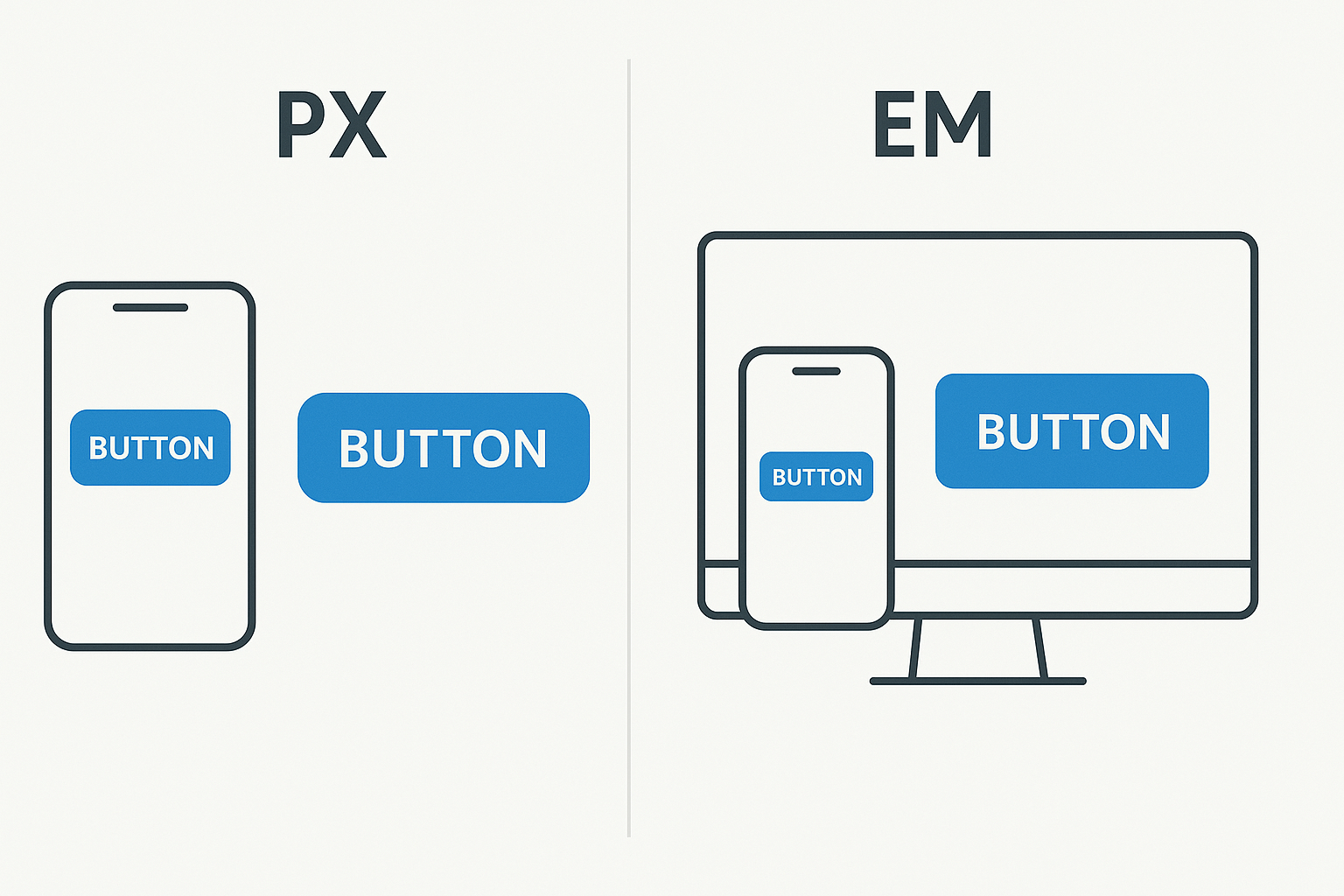
EM units maintain proportions across screen sizes
CSS Implementation Tips
/* Recommended base settings */
html {
font-size: 62.5%; /* 1rem = 10px */
}

body {
font-size: 1.6rem; /* 16px equivalent */
}

/* Component using EM */
.button {
padding: 1.2em 2.4em; /* Scales with button's font-size */
font-size: 1.6rem;
}

/* Global spacing using REM */
.container {
padding: 2rem; /* 20px at base 10px */
}
Sass/LESS Workflow
Create mixins with our converter tool's values:
- Store common conversions as variables
- Use functions for dynamic calculations
- Generate responsive type scales with loops
Key Takeaways
- 1.Always check the parent element's font-size when using EM
- 2.Use REM for global sizing to avoid compounding effects
- 3.Test conversions at multiple breakpoints
Convert PX to EM Now
Free instant results - no signup required